Name
Logo
Branding
Mel, Name, Help
At the beginning of the year, our dear friends reached out. They are the friends we have been through thick and thin with on different sets. You've seen them in the credits and on our Instagram page under Mel Production. Even though we all knew them by this name, they wanted to change it. The team has wanted to change it for a year now, but they have not settled on a new name. So it was not just a simple request for a name change. It was a cry of desperation.
What's With These Big Changes?
When we asked Eva and Yaroslav how they came up with the name five years ago, they were slightly unsure. The big idea got lost somewhere in creating the name, and Mel just seemed to come about on its own. It worked well initially, but as the production company grew, the name no longer seemed to fit. Additionally, being a russian word, it didn't align well with the team's image since they volunteer 50% of their time.
Lights, Camera, Brainstorm!
We had worked with Mel for a long time, and we knew that their team performs incredibly when it comes to production companies. Their team members are passionate about their work, the process, and the results. They are dedicated individuals who do not believe in boundaries or limits. Mel is willing to take on challenges they have never faced before, to create something new that hasn't existed in any category or that the world has never seen before. Their passionate drive and the ability to achieve the impossible have become the symbols of their production company. So, the answer to how the updated Mel should sound was almost obvious.
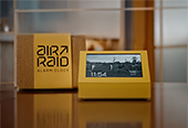
From now on, the production company from Kharkiv will shine on the sets under the name PALAY!
*PALAY from Ukrainian means to be on fire
The idea is that the team works on fire but still sticks to the approved budget. The editor will work passionately and deliver 15 videos per night. The producer will work passionately and deliver three camels, five chef hats for buns, and a blooming fern to Mars. Ultimately, both the production team and the client will be happy because of their passion and enthusiasm!
And What Does That Palay Look Like?
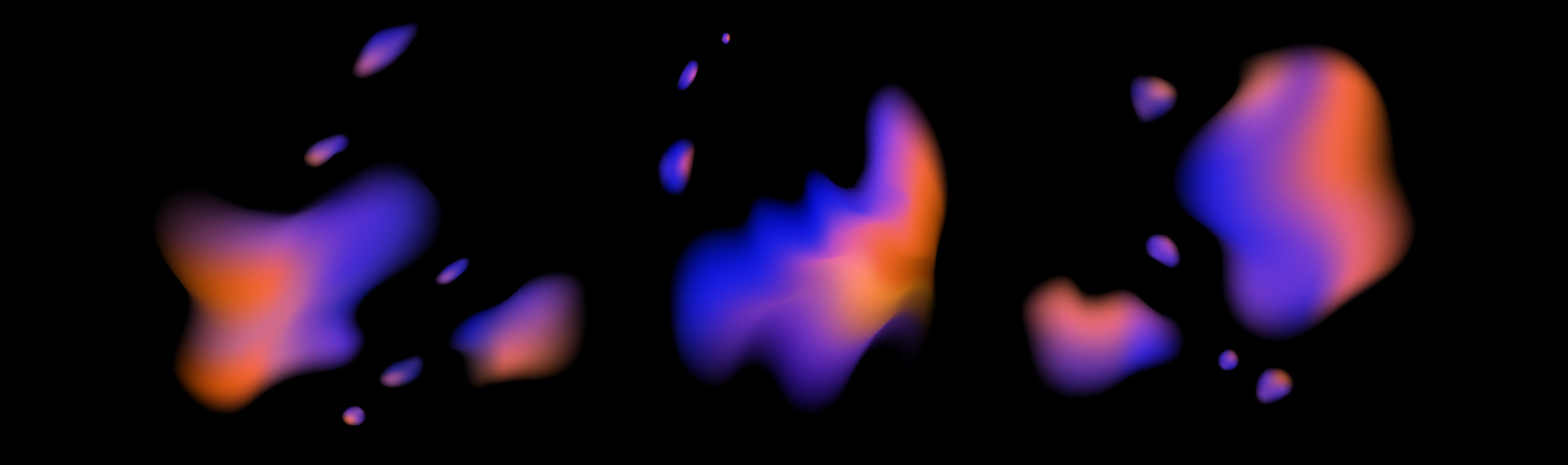
We were getting closer to developing the brand identity. The designers had to create a fiery design. Literally. As a result, we decided to approach the concept from a different angle and explore flames in a new way.While we didn’t start a fire in the office, we observed that there’s no such thing as similar tongues of fire. They vary in shape, color, tempo, rhythm, and saturation. This discovery formed the basis of our visual solution.
Fire = Dynamics
The flame is not orange, as depicted in most graphic designs. It is derived from a cold and intense blue, which then transitions into a softer purple and emits a warm orange glow at the top. This gradient, represented by fiery spots, became the color code for Palay.
Scene 1, Take 3
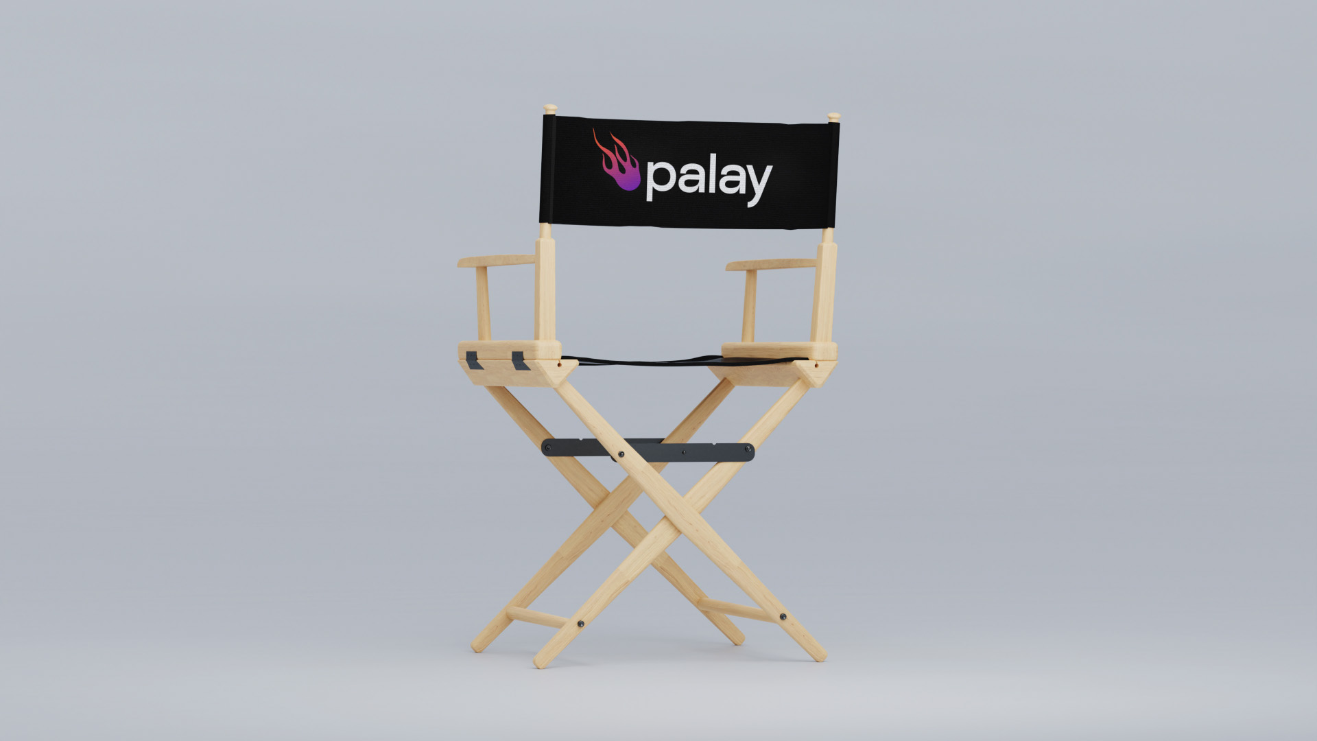
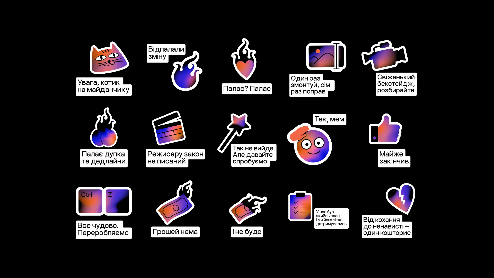
Alright, now Palay is really on fire, not only in the team's hearts but also visually. However, we still needed some objects from a production niche. So we remembered one element always associated with people carrying big cameras — the clapperboard. Or, simply put, the clapper. But we wouldn't be pirates if we took it in its usual form and placed it everywhere. Instead, we decided to steal the layout, blocks, and font types from it so that every subscriber would recognize something directorial but not feel the smell of naphthalene from the obvious solution.
Once again, we are convinced that burning eyes and a desire to ignite is the key to success in any business. So we wish newly-minted Palay even more sparks in clients' eyes and the comments!
Arriba! Creative Agency:
Max Burtsev — Creative Director;
Olya Burtseva — Account Director;
Lera Tkachenko — Account manager;
Yulia Nagorna — Art Director;
Yevhen Babanin — Designer;
Dasha Starko, Alina Herasymchuk — Copywriters.
See also
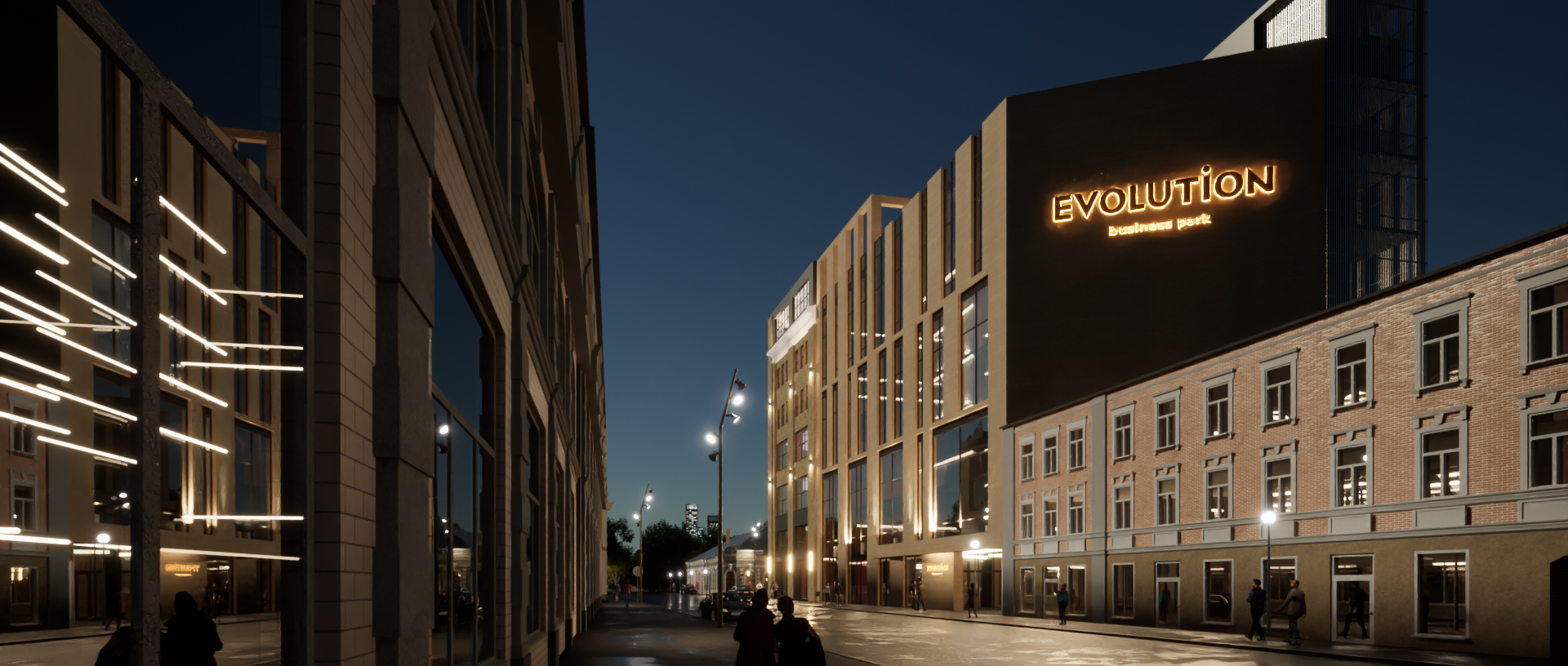
Evolution Business Park
Стратегія, назва, логотип, фірмовий стиль
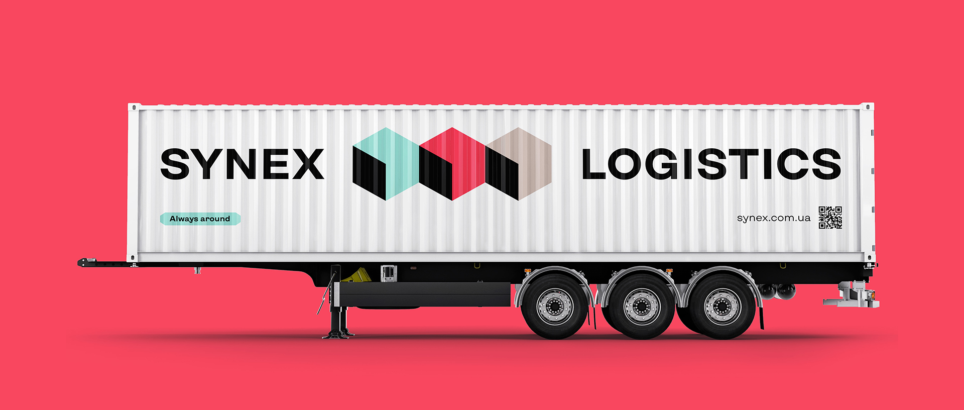
Synex
Стратегія, назва, логотип, фірмовий стиль
Eclectic Talents Group
Назва, слоган, логотип, фірмовий стиль