.
What Will We Be Printing?
Long ago, when the neighbors from the swamp did not plan to migrate to other countries, the beautiful Kharkiv was blooming to benefit all Kharkiv citizens. Around the same time, a friend of our account director asked for professional advice. It turned out that they planned to open a cultural and community center in Kharkiv inside of an old printing house. This is a space for developing socially responsible businesses and socially important projects. It is a location for people who love the city and develop the local culture.
The Process Has Started
Olya had to help select the name for the new point for all creative individuals in Kharkiv. She decided to think about which word would attract the attention of the city's cultural figures. The project founders wanted to reflect the history of the old printing house in the name, along with a modern, light, dynamic sound. Thus, one night, DRUK was born. The ringing Ukrainian name quickly fit into the cultural space. Moreover, the name phonetically resembles the word "friend" (in Ukrainian). That is the space that hints from the first acquaintance that this is a place for like-minded people. And just like that, in a moment, the account director transformed into a copywriter and the cultural center into DRUK.
Then, in February 2022, the Kharkiv citizens primarily defended the city, and the project was halted for an indefinite time.

Time to Refill the Cartridges!
And here, in the spring of 2023, the project founders decided there was no longer time to wait. It's time to revive the cultural life of Kharkiv and bring all the urbanized hipsters back to their hometown.
Founders needed grants to move further and develop the space. Grants require compelling project presentations. To achieve this, an identity that conveys the Printing spirit is necessary. As passionate fans of the city of 1654, we grabbed pencils and paper.
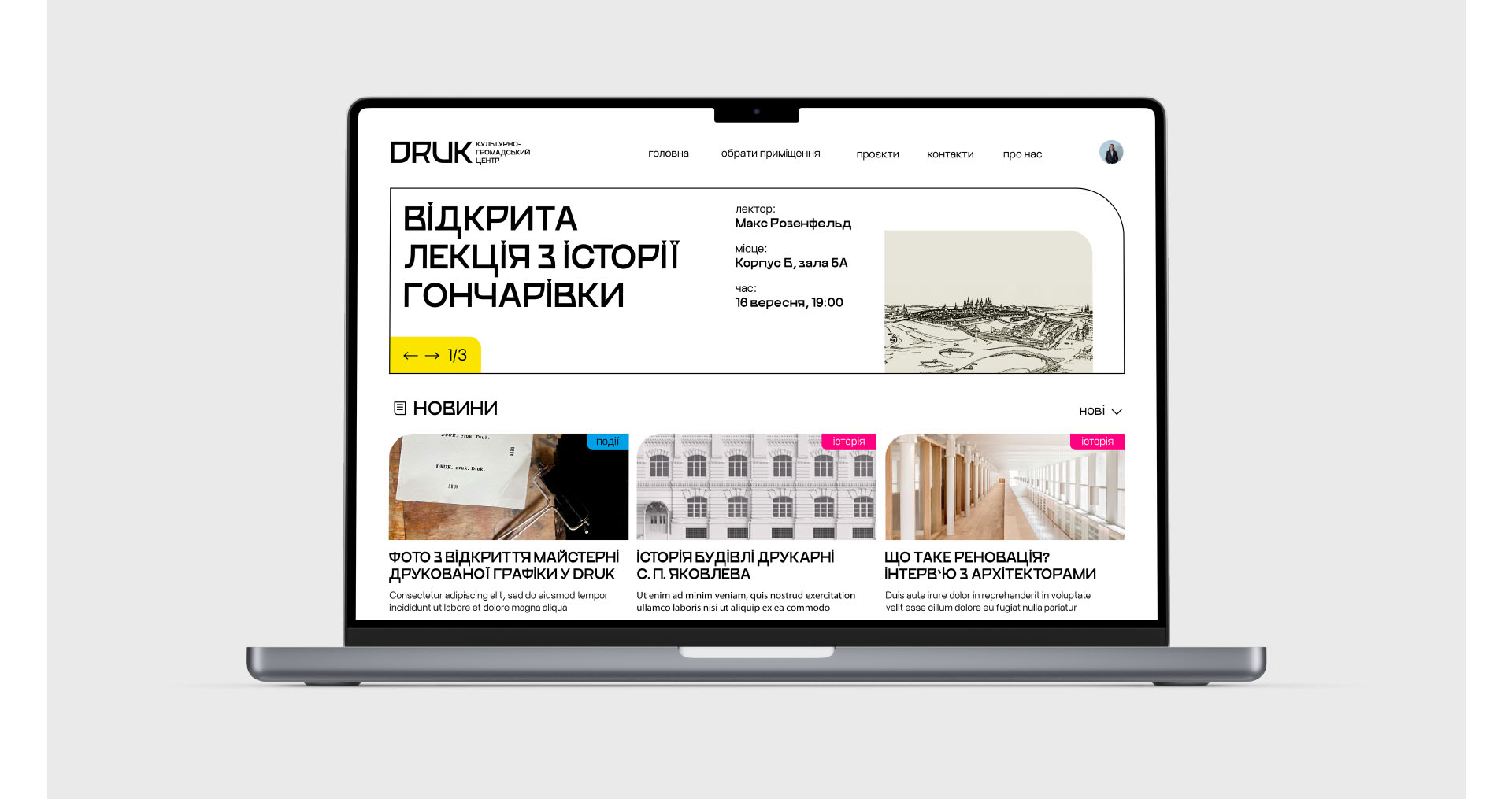
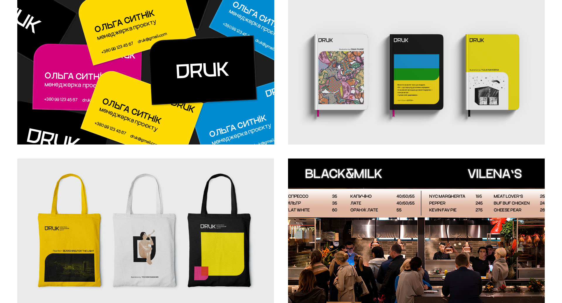
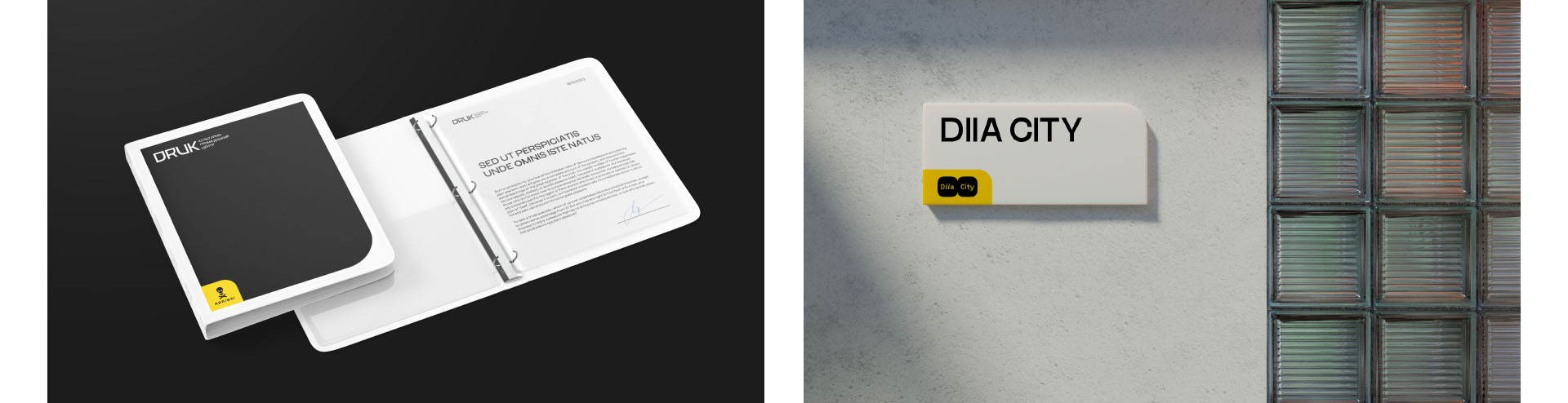
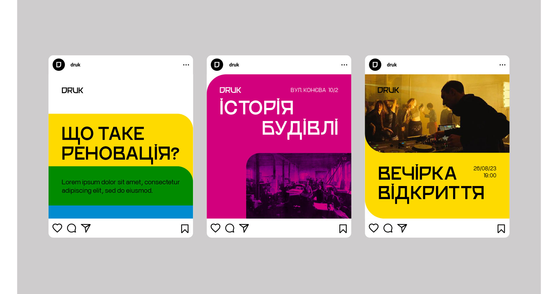
What Hides Behind the Printing Press?
The DRUK team wanted to convey three main points in their corporate style:
- Tangency to the history of the building and connection with the printing business;
- Modernity of the space;
- Ease of scaling the identity.
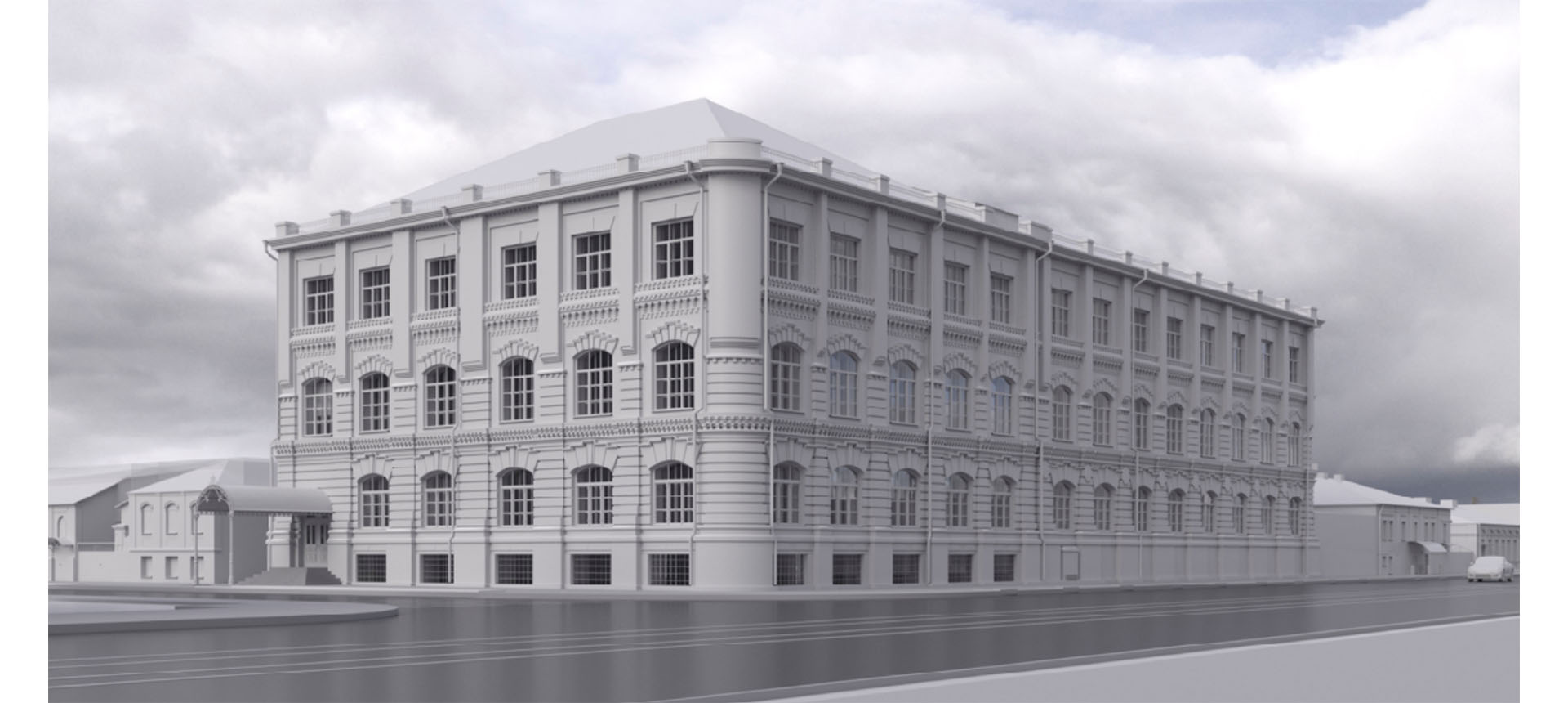
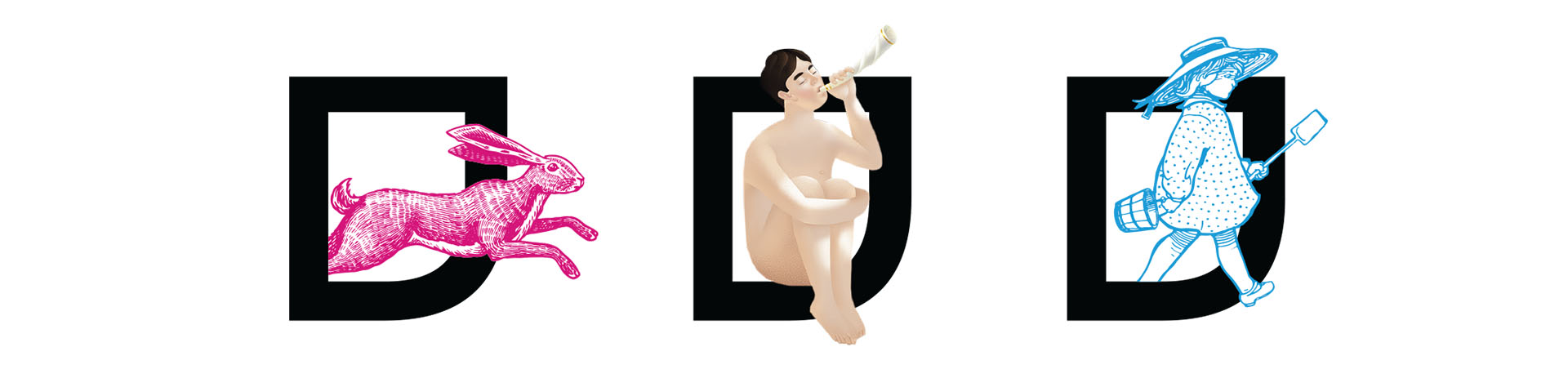
When we reviewed the building of the former printing house about a hundred times and went on a tour of all its corners, we noticed that... there were only a few corners. Due to the rounded sides of the street facade, DRUK always remains without one corner. This finding became the basis for the shape of the corporate style. Thus, some corners disappeared on the letters of the logo.

For the font, we chose Buduj Sans — a modern font inspired by the historical forms of the Cyrillic script of the 11th century. This takes us back to the history and longevity of the printing house building.

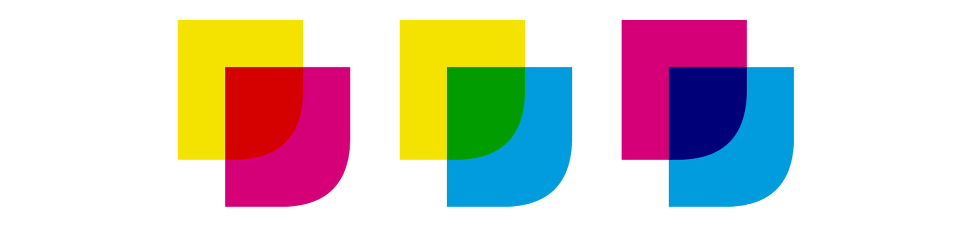
And the final important element of the identity is, of course, the colors. We are sure you will recognize these three circles out of a thousand. These are incomprehensible letters CMYK, which you can find in every printing house. CMYK is an abbreviation derived from four colors: Cyan, Magenta, Yellow, and Key, translated as blue, purple, yellow, and key (black). Even without understanding anything in all that typographic stuff, looking at these three circles, a clear association arises — this is about DRUK!
Sending to Print!
When we handed over all the logos, brand books, and advice, only one thing remained for us — to wait for the official launch of DRUK, which would encapsulate the entire cultural spirit of Kharkiv!
Arriba! Creative Agency:
Max Burtsev — Сreative Director;
Olya Burtseva — Account Director;
Yulia Nagorna — Art Director;
Yevgeniy Babanin — Designer.
See also

Автотранс
Стратегія, рекламна кампанія, рroduction

Охорона та Безпека
Стратегія, логотип, фірмовий стиль, рекламна кампанія, production

YoHub
Стратегiя, назва