Hahatoon
From "Can I have five pieces of those smiley cookies?" to "Give me Hahatoon!"
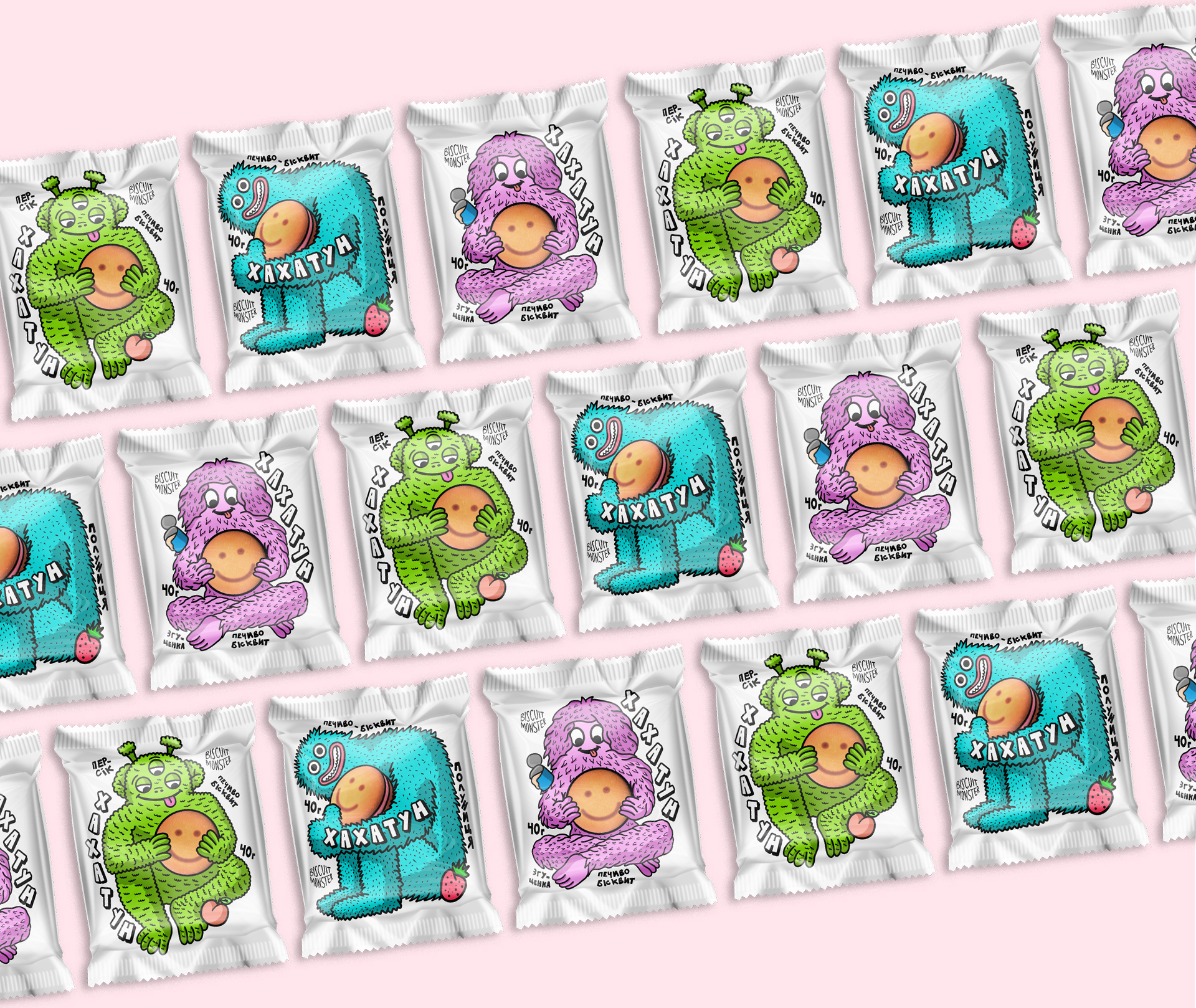
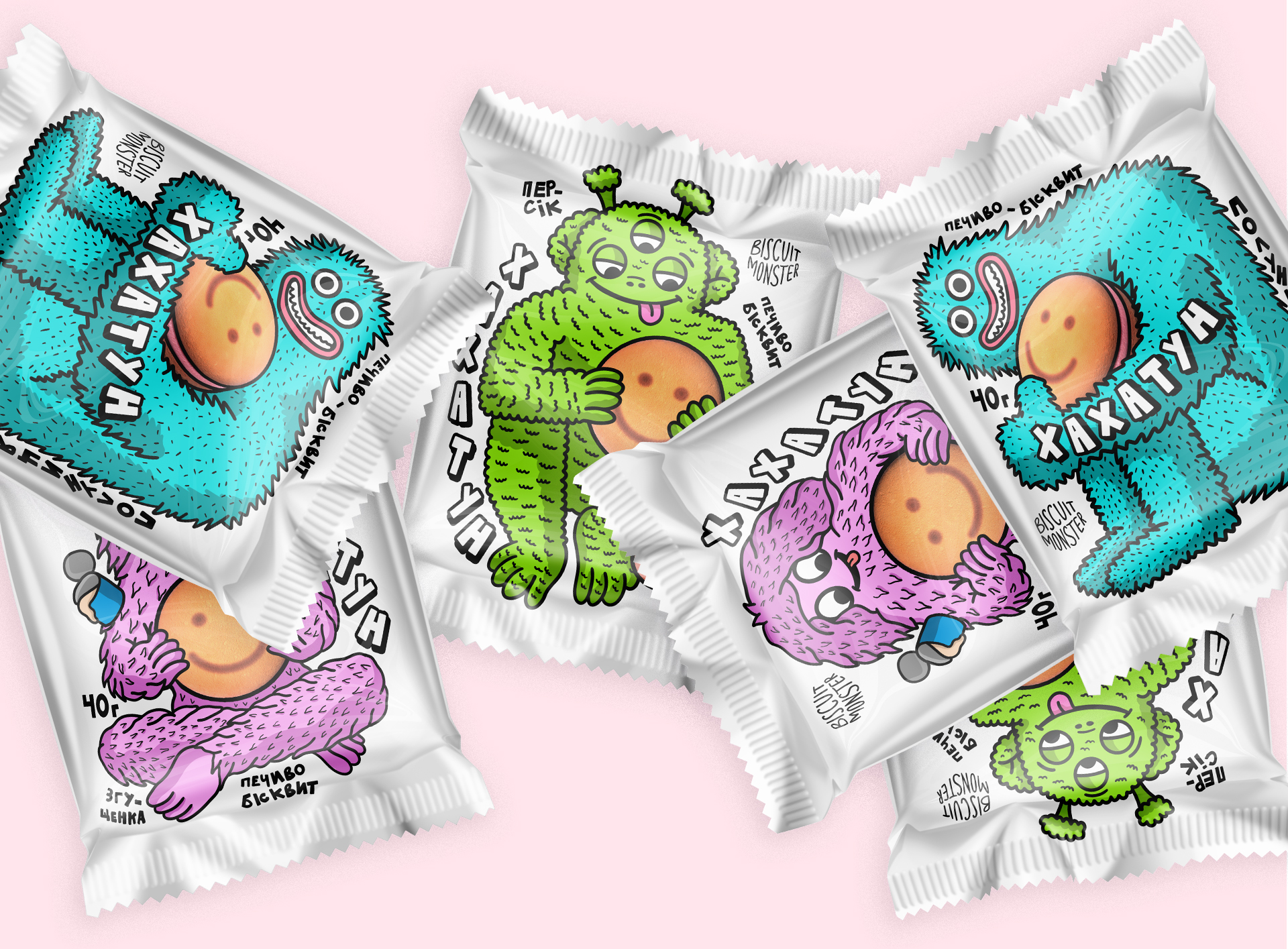
Thanks to the new packaging, the Magic Mosaic brand has an updated and fun style consistent with its other products. Additionally, the packaging showcases the contents inside.
Hahatoon biscuits come in different flavors and are very soft and delicious. You might have spotted them in the cookie aisle, where they look like smiley faces. Each biscuit is packaged in clear cellophane to keep the cookies fresh.
Our next step is to elevate Hahatoon to the level of popular confectionery brands such as Snickers and Kit Kats. We plan to transition the product from its placement in boxes in the cookie section to the snack aisle. This will make it easier for people to grab a cookie for a quick snack. To accomplish this, we must make minor adjustments to ensure everything runs smoothly.
While at the local supermarket, we noticed a variety of candy bars on display near the checkout counter. Each package had its unique and colorful design, with different colors and fonts representing various flavors. For example, pink packaging was used for strawberry-flavored candy bars, while brown packaging was used for chocolate-flavored ones.
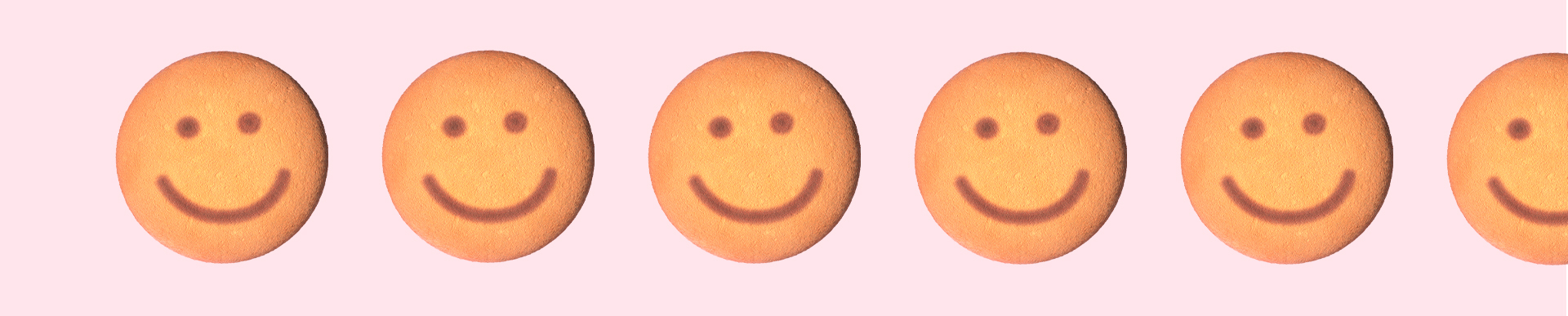
Back at home, we gave Hahatoon another spin and bingo!
The cookies are attractive, with their smiling faces indicating their flavors: pink for strawberry and brown for chocolate. Therefore, we have included this smiley design in the upcoming packaging.
But what can we add to make Hahatoon stand out among the other stars of the candy aisle?
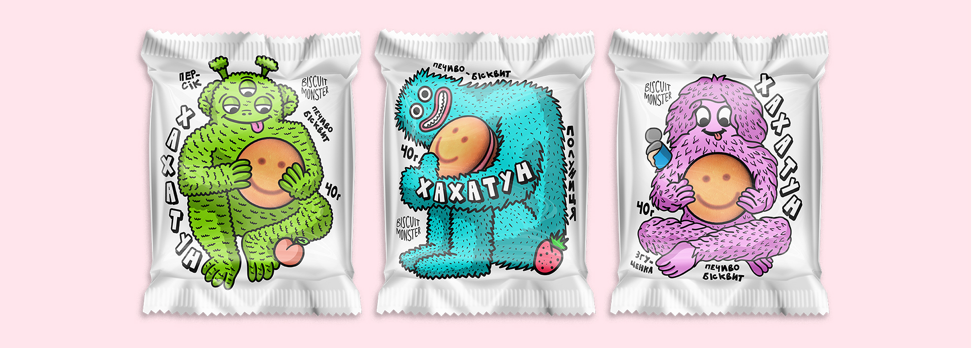
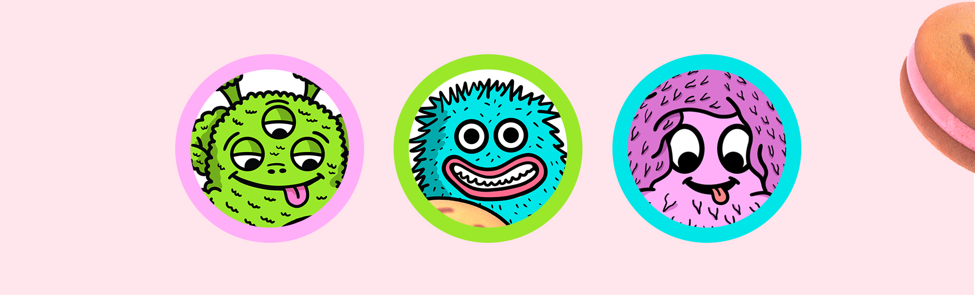
We realized that people are familiar with the characters from other Magic Mosaic products, such as the beloved Cookie Monsters, so we decided to continue with the theme of monsters.
At that moment, our children eagerly enjoyed the biscuits and demonstrated their fondness for them to everyone present.
This product is unique because of its cute character designs, setting it apart from traditional snacks like wafers, bars, and cookies. All the essential information about the product and its producer can also be found on the back.
I have been hoping for a brand to approach me so that I can design packaging in my unique style. In my free time, I create illustrations perfectly aligned with my vision. Unsurprisingly, few brands have distinctive characters like Nestlé's Quicky Rabbit and other beloved children's breakfast cereals. This direction is incredibly vibrant and captivating. Just look at what they are creating in Asian countries — their characters leave a lasting impression you will remember forever. Therefore, I aspire to work in this field in Ukraine to open up a broader avenue for creative solutions in brand characters.
Dima, the project's designer

Hahatoon will soon appear in the updated packaging in a brand-new sales section. Don't just walk past it. Let it bring a smile to your face, and take it home with you. Its eye-catching design will capture your attention and make it impossible to miss.
Dima Alimov — Illustrator, Designer;
Yulia Nagorna — Art Director;
Zhenya Babanin — Designer;
Max Burtsev — Creative Director;
Olya Burtseva — Account Director.